I also made a decision to try another paper. Trinity was done on gray paper and I found the painting getting really dark. It was a struggle to lighten up the facade and the result is a little too yellow. So I'm going shopping tomorrow for some blanc paper!
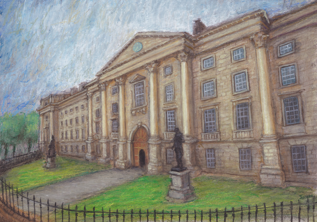
I intend on doing more paintings about architecture. It's probably my favorite subject matter. Trinity College is situated promently in the heart of Dublin city and I walk past it almost every day. While it's not the most decorative of buildings out there, there is something awesome about it's entrance and the long facade.
I also made a decision to try another paper. Trinity was done on gray paper and I found the painting getting really dark. It was a struggle to lighten up the facade and the result is a little too yellow. So I'm going shopping tomorrow for some blanc paper!
0 Comments
Updated with 2 new ones. Rock of Cashel and Trinity College. I've always been struck by the dramatic ruin at Cashel. It's a really stunning place to visit. I sort of struggled with some of the foreground, I'm working on a gray paper and I just wasn't getting the brights I desired. However I do feel my composition captured the vertical orientation of the place.
I completed this a month or more ago, finally got around to scanning it and uploading here. Now that my wife and I have returned to Ireland from France, I have finally got around to re-visiting this website.
I've finished a couple of paintings, and uploaded this one today. It's quite large - 2x4 feet (60cm x 120cm). Oil on canvas. This is my latest painting.
I used OilBars and oil paint. It is the second one in a the theme of dandelions. This time I used a dramatic perspective. But I also wanted to include some Van Gogh influences, which I think i accomplished with some of the swirls in the sky. Here is the painting and 2 areas of detail. I'm calling this one Parc Brequigny as it reminds me very strongly of a local park here in Rennes. I found the original in a book of Van Gogh's paintings. While it was my goal to essentially copy the work, I found my brush strokes were not as fluid as his and this led me to create my own differences, particularly with the blue fir tree. Nevertheless I am satisfied with my approximation. One can easily see the difference in hues, but then again the source taken from the book (on the left) is a crude scan. I've been finding substantial differences in hues between scanned images of Van Gogh's paintings on the web.
Would love to actually see the original work, apparently last seen in an auction at Christie's in NY 13/05/1980 Uploaded my latest Van Gogh inspired work.
It's Mont St Michel, which is one of my favorite places in Brittany. Featuring this dramatic medieval cathedral and town built ontop of this rock of an island. I am happy with my capturing a swirling sky borrowing from VanGogh. The terrain in the foreground proved challenging, but I feel I captured a sense of wildness and unkempt grasses blowing with the breeze. The castle itself was also troubling and provided a useful lesson. I had painted the sky and let it dry entirely before painting the castle over it. I now feel i should have painted the castle at the same time, as I would have been using the exact hues i used in the sky. Doing so would probably have let the castle inhabit the same space as the sky, and i think today it looks very like the castle was painted later, like an after thought. But it still makes for a dramatic piece i think. Here's another Van Gogh study I've done.
Mostly using OilBars again. I found the selection of colours I have rather limited for this one, but enjoyed the bright red poppies. Once again one can find many different versions of this work online, and they all have different hue saturations. To prepare for an original work based on The Sower, I have completed a study. It's a small piece - just 7x5 inches (18x13cm).
The Sower is a common theme of Vincent's, one that he returns to again and again in his life. This is a very iconic painting that takes this famous religious parable to a new level, as The Sower is painted almost "walking on water". While I have little time for religious obsession, I admire the the painting greatly. Not only for it's impressionist, and very Pointillist technique but also it's colour scheme. Yellows and Oranges in contrast with their direct opposites: Violet and Blues; juxaposed as ordinarily one would expect the cooler colours to recede into the background, while the warm colours take the foreground (in conventional painting). Anyway, i feel satisfied with my attempt. It's difficult to know exactly the colours Van Gogh used as there are many variations found online! Continuing to experiment with my new "oil bars".
I initially considered using this painting only for it's composition and I planned to just go a bit wild with the colours and brush strokes. I started with the sky and after my results seemed very similiar to Van Gogh's original, I changed my plan and went for a fairly direct copy. The OilBar colours I have matched up well. |